Colour is one of the most emotionally driven decisions in any kitchen project. It is also one of the most frequently changed, and most often regretted when changed for the wrong reasons. In a space that represents a significant investment and that you will live with for many years, choosing a colour based purely on current trends carries real risk. This guide is designed to help you look beyond the trend cycle and towards a palette that will serve both you and your kitchen for the long term.
If you would like guidance tailored to your space, please contact us with any questions and book a design appointment with Ornate Kitchens.
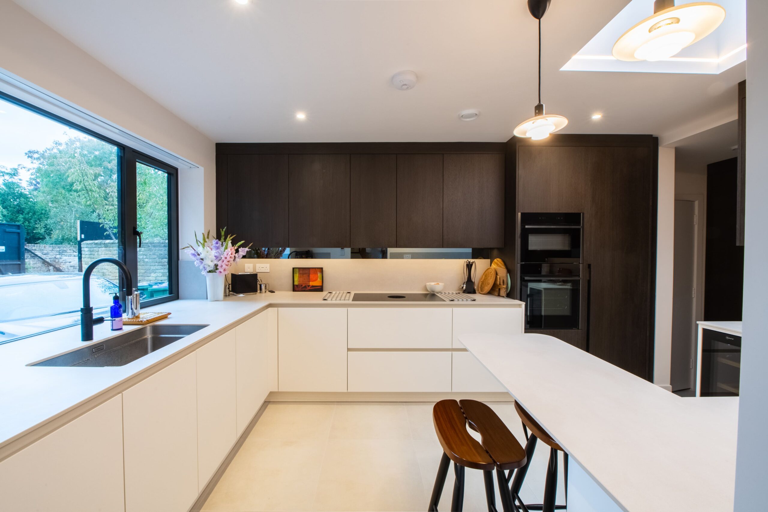
At Ornate Kitchens, colour discussions are some of the most detailed conversations we have with our clients. We consider the architecture of the space, the natural light, how the kitchen connects to surrounding rooms, and the client’s wider interior style. The outcome is never a trend-led choice, it is a carefully considered recommendation tailored to your home.
Why Colour Matters More in a Kitchen Than Anywhere Else
In most rooms, changing colour is relatively simple, a fresh coat of paint can transform a space in a day. In a kitchen, however, the dominant colour is set by the cabinetry, which is intended to last for many years. That permanence raises the stakes, and it is why decisions made in a showroom or based on images on a screen can sometimes fall short once installed.
Light plays a defining role. A colour that appears warm and inviting in a bright, south-facing room can feel muted or flat in a north-facing space. Similarly, a bold shade that feels balanced in a large open-plan kitchen may feel overwhelming in a smaller layout. Seeing samples in your own space, at different times of day, is essential before making a final decision.
The Enduring Appeal of Neutral Kitchens
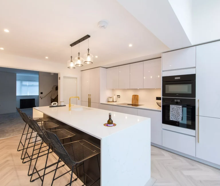
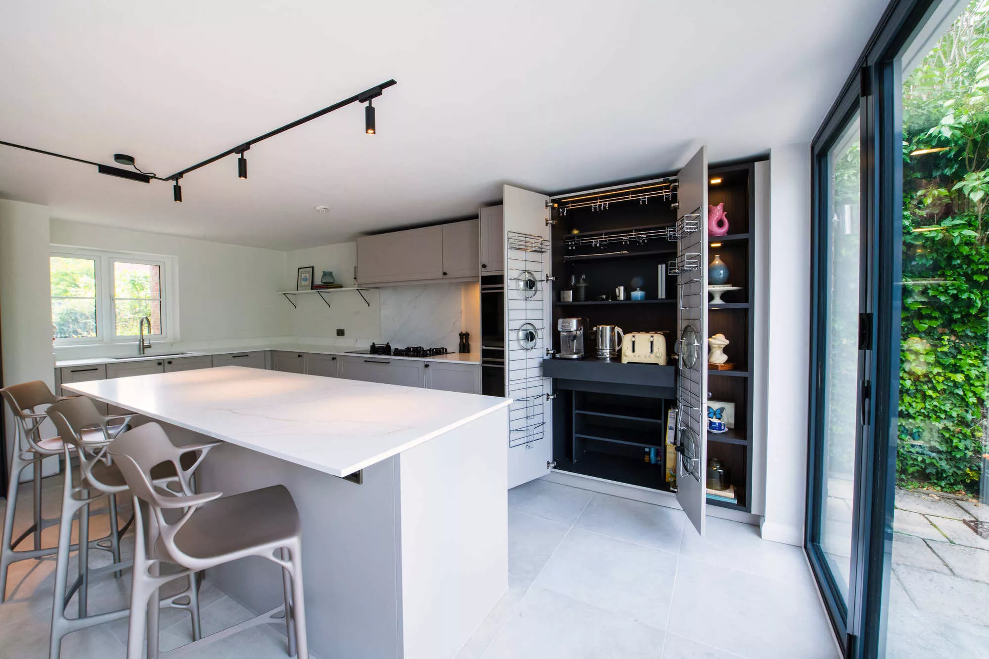
Neutral kitchens are not a compromise, when chosen well, they are among the most refined and adaptable options available. Shades such as warm off-whites, soft putties, and layered greiges offer subtle depth while remaining versatile enough to work with evolving materials, finishes, and accessories.
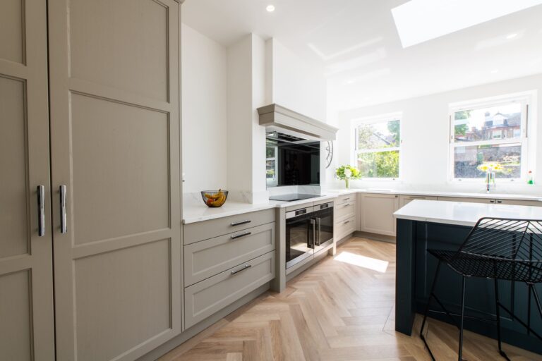
The most successful neutrals tend to have warmth in their undertones and pair naturally with materials like timber, stone, and linen. They also respond to changing light conditions, creating a sense of depth rather than appearing flat. In painted in-frame kitchens especially, these nuanced tones highlight the craftsmanship and detailing in a way that stronger colours often cannot.
The Rise of Considered Colour
Colour in kitchen design has evolved. Rather than stark contrasts or purely trend-led palettes, today’s kitchens are more layered and intentional.
Greens
Green remains one of the most popular choices in kitchen design. From deep forest tones to soft sages and muted olives, it brings a sense of calm and depth that works across both modern and traditional styles. The key consideration is undertone, cooler greens can feel flat in certain lighting conditions, while overly warm tones may lean towards khaki.
Blues and Blue-Greens
Dusky blues and blue-greens have moved from trend to staple. They work particularly well in more classic designs, where the richness of colour complements detailing and craftsmanship. However, in darker spaces, these tones can feel heavier, so careful consideration of light is important.
Warm Earthy Tones
A growing shift towards warmer palettes has introduced tones such as terracotta, clay, and soft taupe into kitchen design. These colours bring warmth and tactility, pairing beautifully with natural materials and working especially well in open-plan spaces where the kitchen blends into the wider living environment.
Dark and Dramatic
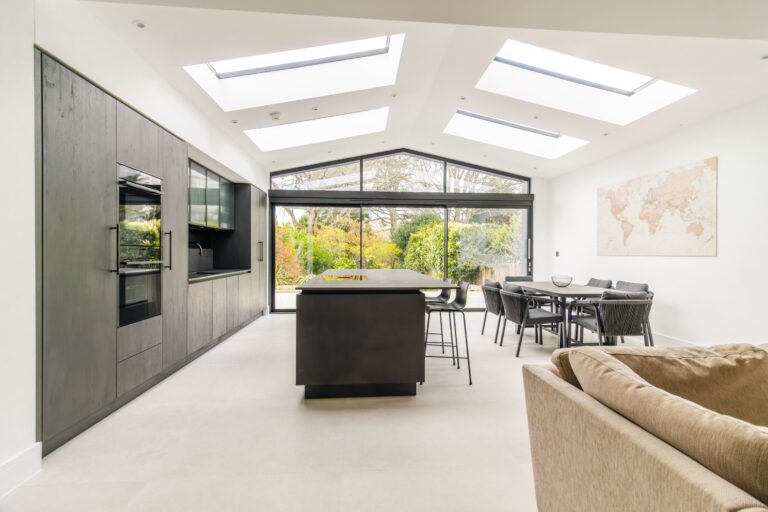
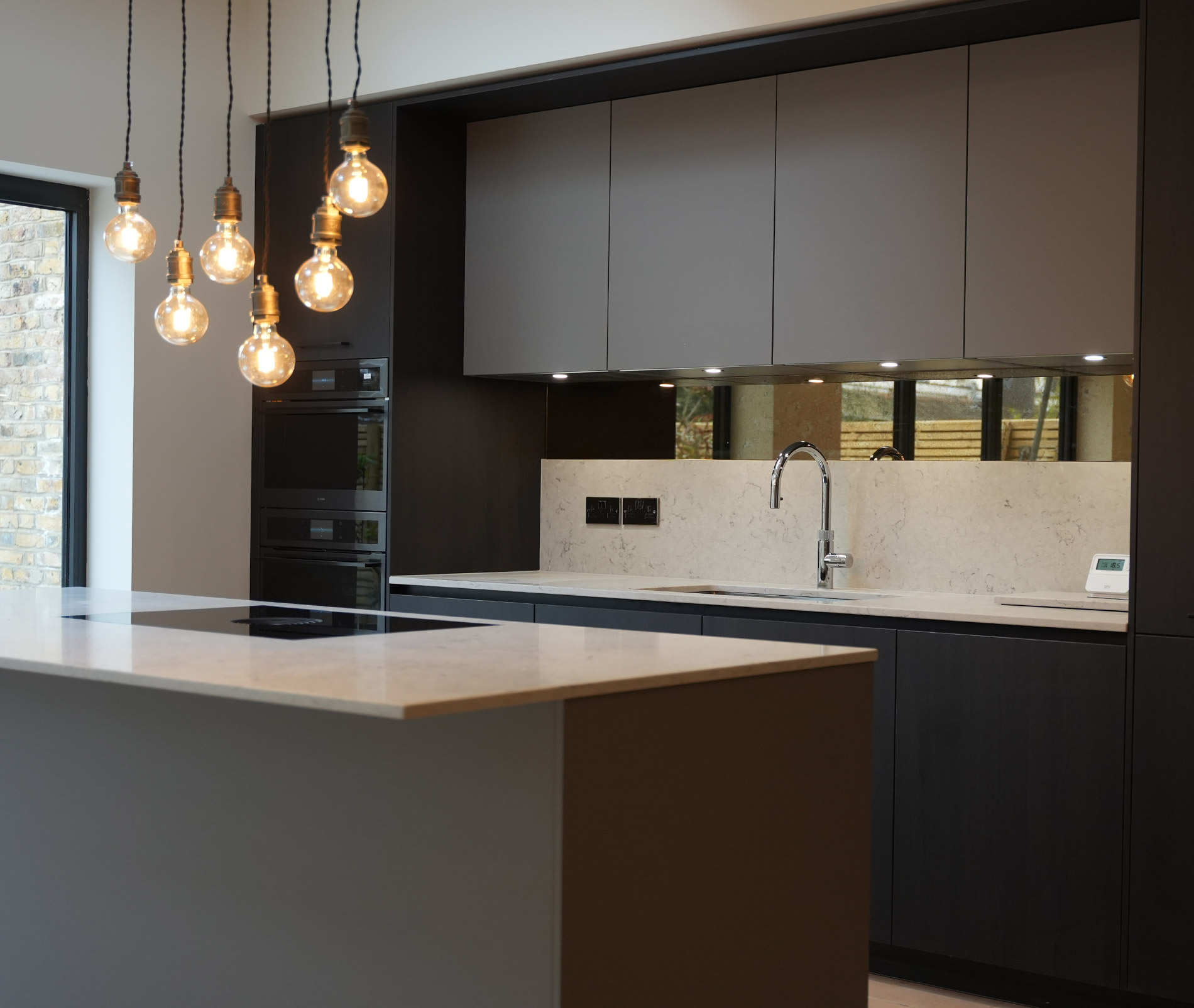
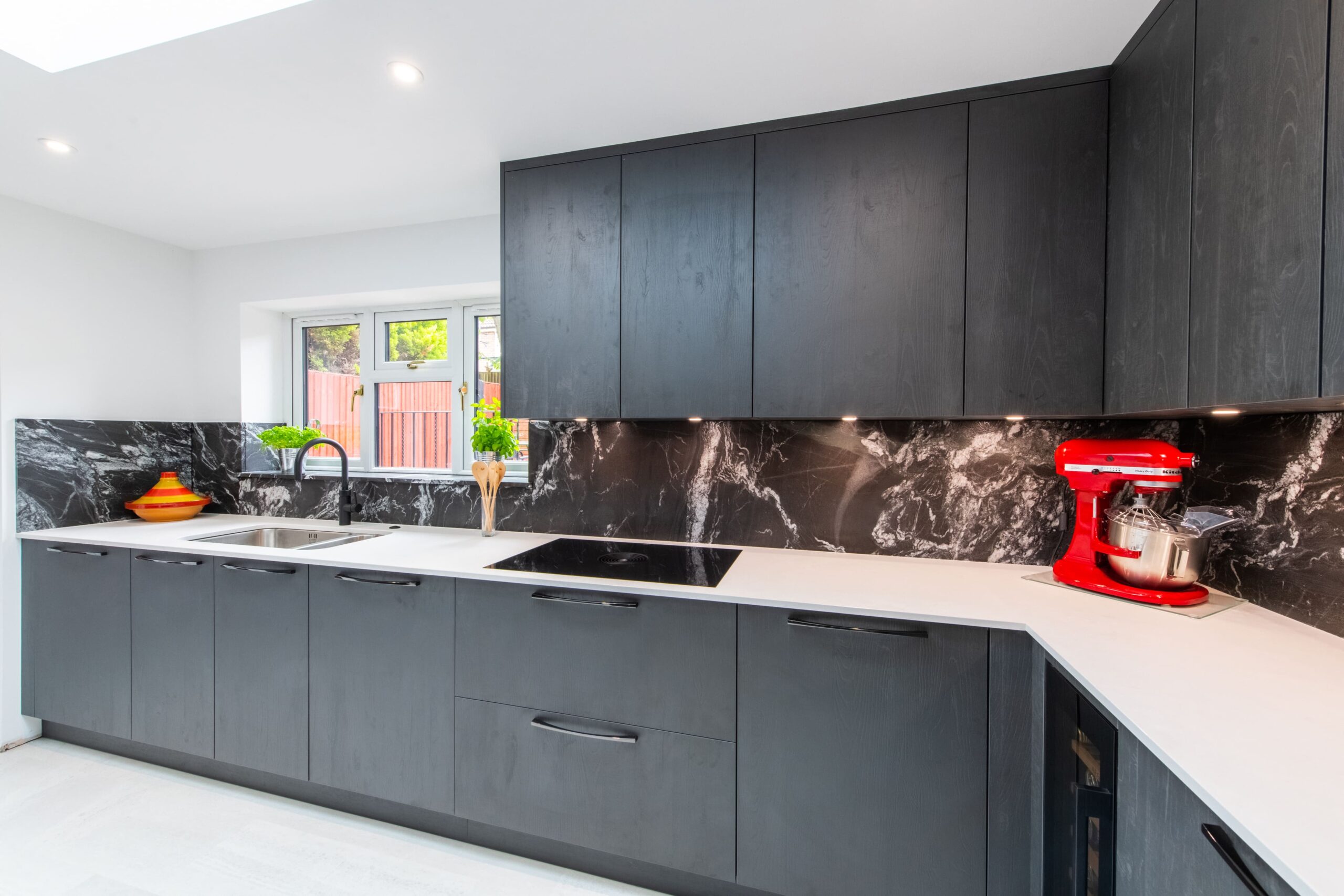
Deep charcoals, near-blacks, and dark navies remain popular, particularly when used selectively. A darker island or lower cabinetry can create a striking contrast without overwhelming the space. The success of darker palettes depends heavily on lighting, proportions, and balance with lighter elements.
Two-Tone Kitchens: Getting the Balance Right
Two-tone kitchens, where different colours are used for upper and lower cabinets or for an island, are a hallmark of considered design. When done well, they create visual interest and balance.
Successful combinations usually share a tonal harmony, with both colours sitting comfortably together rather than competing. Clear contrast is important, subtle differences can feel unintentional, while a well-defined pairing feels deliberate. Worktops often play a key role in tying the scheme together, acting as a bridge between colours.
Matt vs Gloss vs Textured Finishes
Colour is only one part of the equation, finish also plays a significant role.
- Matt finishes offer a soft, contemporary look and allow colours to appear at their most natural.
- Silk or satin finishes provide a balance between aesthetics and practicality.
- Gloss finishes reflect light and are easy to maintain, often suited to modern kitchens.
- Textured finishes introduce depth and tactility, particularly in contemporary designs.
Each finish affects how colour is perceived and should be considered alongside the overall design.
How to Sample Kitchen Colours Properly
Choosing colour from small samples or images is one of the most common mistakes. Colours behave differently at scale and under different lighting conditions. To make a confident choice:
- Use large door samples in your space
- Observe them throughout the day
- Compare them alongside your worktops, flooring, and fixed elements
- View colour combinations together if considering two tones
- When unsure, lean slightly lighter or more neutral, colours often appear stronger at scale
Colour and the Ornate Design Process
At Ornate Kitchens, colour selection is always a collaborative process. Our designers draw on experience from real projects, understanding how colours behave in different environments and how they age over time.
Where projects extend beyond the kitchen into wider interiors, we consider the full palette of the home to ensure a cohesive result. The aim is not just a beautiful kitchen, but one that feels integrated and balanced within the overall space.
To explore how this approach could work in your own home, book a design appointment with Ornate Kitchens and speak with one of our experienced designers.
Frequently Asked Questions
What is the most timeless kitchen colour?
Warm neutrals such as off-whites, putties, and soft greiges remain the most enduring choices. However, a colour chosen with confidence and suited to your space will always feel more timeless than one chosen purely on trend.
Should upper and lower kitchen cabinets be the same colour?
Not necessarily. Two-tone kitchens can create a more dynamic look, provided the colours are tonally balanced and work together cohesively.
Is matt or gloss better for kitchen cabinets?
Both have advantages. Matt finishes offer warmth and subtlety, while gloss finishes are more reflective and easier to clean. A satin finish often provides a practical middle ground.
How do I choose a kitchen colour if my space has poor natural light?
Warmer tones tend to perform better in darker spaces, helping to counterbalance cooler light. Reflective surfaces and a well-planned lighting scheme can also enhance the result.
Will a dark kitchen colour make my kitchen look smaller?
Not always. In well-lit spaces, darker tones can feel rich and sophisticated. In smaller or darker rooms, using dark colours selectively can achieve a similar effect without overwhelming the space.
How do I choose between colours like green and blue?
Bring samples into your space and observe how they interact with your lighting and materials. The right choice will feel consistent with your home as a whole.
Choosing a kitchen colour becomes far easier, and far more rewarding, with the right guidance. Book a design appointment with Ornate Kitchens and let us help you create a palette that feels right for your home, your light, and your lifestyle.