Colour is one of the most powerful tools in kitchen design, and also one of the most frequently mishandled. When it works well, a considered colour palette gives a kitchen warmth, personality and a sense of genuine design intention. When it does not, the result can feel busy, unresolved or simply exhausting to be in. The difference almost always comes down to how the colours have been chosen and combined, rather than the colours themselves.
This guide from our design team at Ornate Kitchens covers the principles behind successful colour mixing in a kitchen, with practical guidance you can apply to your own project.
START WITH A DOMINANT COLOUR
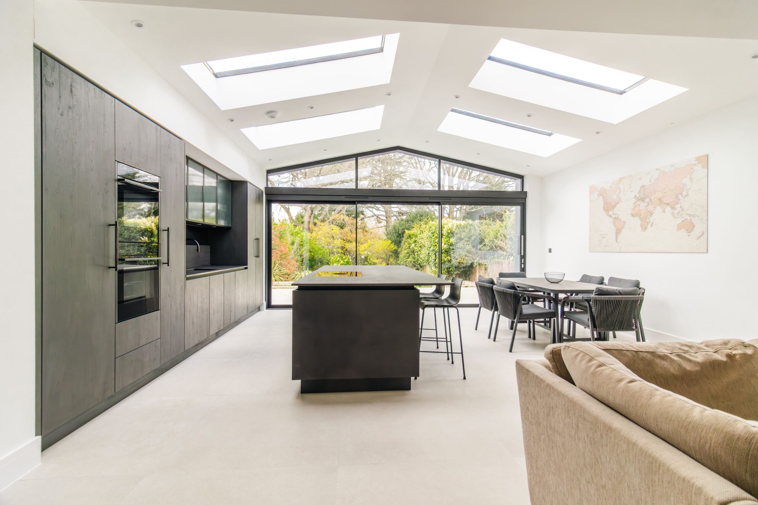
Every successful multi-colour kitchen has a dominant colour that anchors the scheme. This is typically the colour used on the majority of the cabinetry, usually the perimeter base and wall units. It sets the tone for everything else and should be chosen with care, considering how it reads in your specific light conditions, how it relates to the other fixed elements in the space (flooring, walls, ceiling), and how it will feel to live with over time.
For a painted kitchen, the dominant colour might be a warm off-white, a soft sage green, a deep navy or a chalky grey. Whatever it is, it should feel confident rather than compromised. A colour chosen because it is the least offensive option rather than the most genuinely desired one rarely produces a kitchen you will love.
THE POWER OF A CONTRASTING ISLAND
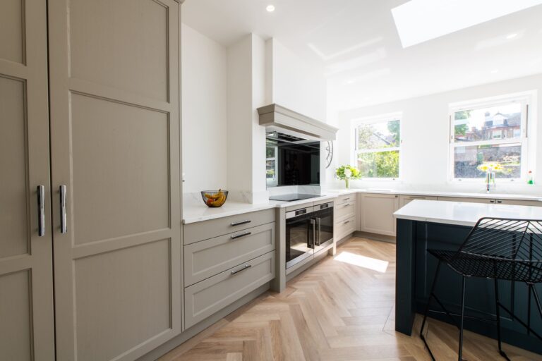
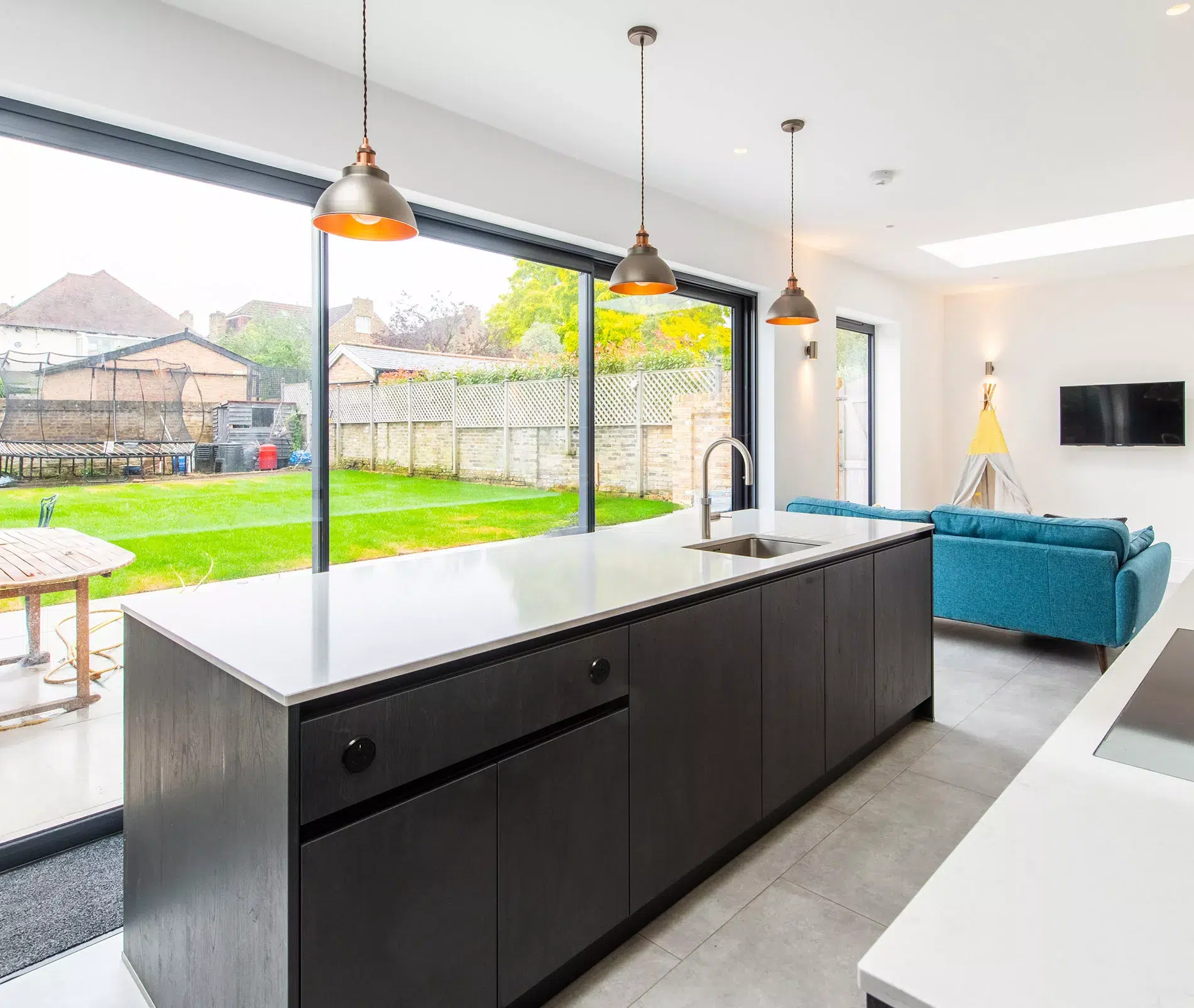
The single most effective way to introduce a second colour into a kitchen without visual confusion is to use it on a freestanding or semi-freestanding element such as the island. An island in a contrasting colour, whether that is darker, warmer or simply from a different part of the colour spectrum to the perimeter units, creates a clear focal point without disrupting the coherence of the rest of the scheme.
This approach works because the island is read as a distinct object within the room, separate from the run of perimeter cabinetry. The contrast between the two is therefore expected rather than surprising. When done well, it gives a bespoke kitchen a layered quality that feels considered rather than arbitrary.
LIMIT YOUR PALETTE TO THREE ELEMENTS
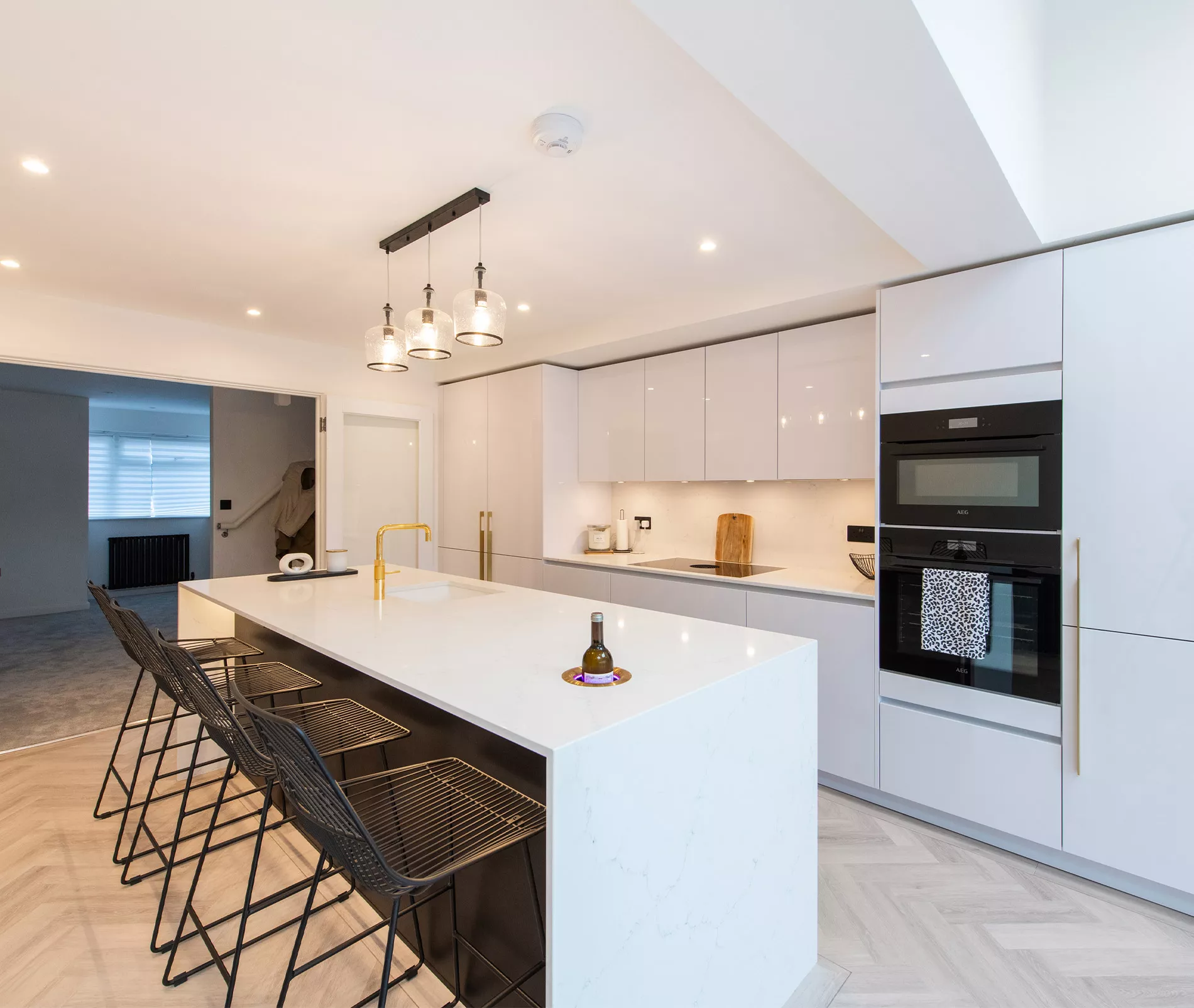
A kitchen that feels cluttered with colour is almost always one in which too many distinct colours have been introduced. As a working principle, limit your considered colour choices to three elements: the dominant cabinetry colour, a second cabinetry or island colour, and an accent. The accent might be introduced through hardware, bar stools, a pendant light, or a decorative tile. Beyond three distinct colour notes, the visual noise becomes difficult to manage.
Worktops, walls and flooring also carry colour, but these tend to be more neutral in most kitchen schemes. If your worktop has strong pattern or colour, your cabinetry needs to be correspondingly calmer to avoid the two competing for attention.
TONE MATTERS AS MUCH AS HUE
Two colours that clash in hue can often be made to work together by adjusting their tone. Colours of a similar depth and saturation, even if from different parts of the spectrum, tend to read as related rather than conflicting. A dusty sage and a dusty terracotta, for example, work together in a way that a bright sage and a bright terracotta would not, because the shared tonal quality creates a visual coherence that overrides the hue difference.
This is a principle that experienced kitchen designers understand intuitively and can guide you through during the specification process. It is also why looking at paint colours on screen is a poor substitute for viewing actual samples in your own kitchen, under your own light conditions.
THE ROLE OF NEUTRALS IN A COLOURED KITCHEN
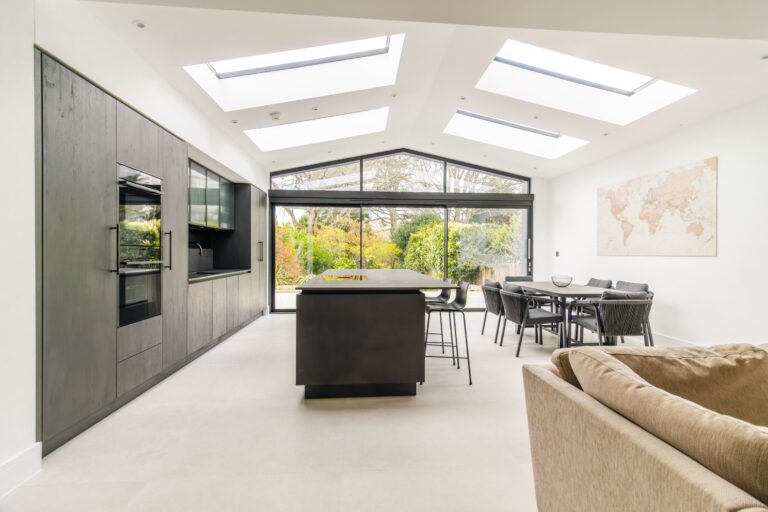
Neutrals, whether white, off-white, stone, grey or warm beige, serve an essential function in any multi-colour kitchen scheme: they provide visual breathing room. A kitchen in which every surface carries colour can feel relentless. Introducing a neutral on walls, the ceiling, or in the worktop gives the eye somewhere to rest and allows the coloured elements to register more clearly.
If you are planning a kitchen renovation and considering a bold colour scheme, discuss the full material palette with your designer from the outset. The relationship between cabinetry colour, worktop, wall finish, flooring and ceiling will determine whether the overall effect feels harmonious or overwhelming.
FREQUENTLY ASKED QUESTIONS
How many colours can I use in a kitchen without it looking busy?
As a general guide, three distinct colour choices is the working limit for most kitchens. A dominant cabinetry colour, a contrasting island or secondary colour, and an accent through hardware or accessories. Beyond this, the scheme can become difficult to resolve without specialist design experience.
Does using two cabinet colours always look good?
Not automatically. Two-tone cabinetry works well when the colours are chosen with intention and the split between them is clear, for example upper units in one colour and lower units in another, or perimeter units versus island. When the split is inconsistent or the colours are poorly matched in tone, the result can look unresolved. Working with an experienced designer makes a significant difference here.
Can dark colours work in a smaller kitchen?
Yes, when used with care. A deep colour on the perimeter cabinetry can feel very contained and intimate in a smaller space rather than oppressive, particularly when the walls, ceiling and worktop remain lighter. The key is ensuring the space has adequate lighting to compensate for the darker tones absorbing more of the available light.
Should my kitchen colour relate to the rest of the house?
In an open-plan space, yes, there should be a clear relationship between the kitchen palette and the adjacent living or dining area. In a more enclosed kitchen, there is more freedom. That said, an entirely disconnected colour scheme can feel abrupt. Drawing on colours used elsewhere in the house, even loosely, tends to create a more coherent overall interior.
Is it better to choose bold colours on upper or lower units?
Lower units carry more visual weight because they cover a larger area of the room. Keeping upper units lighter and placing the bolder colour choice on the lower units tends to feel more grounded. The reverse, bold upper units and lighter lower units, can work as a deliberate inversion but requires more confidence in the design.